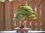
The red is much less a distraction than the yellow in my eye ( and the yellow reflects back on the folliage to make it appear less green. And you are right about the red in the pot highlighting the live vein in the tree.Just playing with ideas... Some of the virts look weird because the pot was photoed under different lighting. Additionally I am using the black background, but you can imagine the tree/pot combo would look much different if you had it on a tatami or against a lighter background.
Green. Very peaceful. Works really well with the moss.
View attachment 120279
Much stronger. Yellow to contrast, red/brown to pick up the live veins.
View attachment 120340
Playing with a different shape and red to pick up the live vein and grey to pick up the deadwood. It would be a lot more subtle under natural lighting. Something about this pot draws me... when I look at the tree the pot glaze (out of the corner of my eye) looks like a landscape. It may be too strong and distracting though.
View attachment 120341
These are all round/oval pots. I personally would never put this tree in a rectangle it is way too informal.
You are using an out of date browser. It may not display this or other websites correctly.
You should upgrade or use an alternative browser.
You should upgrade or use an alternative browser.
Itoigawa juniper Stock
- Thread starter Brian Van Fleet
- Start date
-
- Tags
- bvf itoigawa juniper progression
Bonsai Nut
Nuttier than your average Nut
I think I'd put it on the other side of the oval. The key branch, the long cascading branch is on the left. Therefore, the tree should be potted to the right.
Personally, I think that cascading branch would need to become much more dominant before it would balance the tree being shifted to the right. Here is a virt with the base almost perfectly centered (which I know you should not do) and the tree feels unbalanced and heavy to the right. If I continue to move the tree right, it looks like it will fall over...
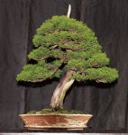
But as I start to beef up that descending branch, the tree starts to regain balance...

Bonsai Nut
Nuttier than your average Nut
Tutorial anywhere?
I'm not sure there is one. Maybe I should make a quick one and put it on YouTube. It really isn't hard once you get comfortable with it.
I think it looks better centered in the oval than it does on the left. Actually, a round pot works just fine. The foliage mass looks pretty balanced to my eye.Personally, I think that cascading branch would need to become much more dominant before it would balance the tree being shifted to the right. Here is a virt with the base almost perfectly centered (which I know you should not do) and the tree feels unbalanced and heavy to the right. If I continue to move the tree right, it looks like it will fall over...
View attachment 121403
But as I start to beef up that descending branch, the tree starts to regain balance...
View attachment 121404
The key branch is the long cascading one on the left side. Even though it's not the lowest.
The "key branch" concept is a bit of an evolution to the old "Number 1 branch" idea. It recognizes that the most important branch may not necessarily be the lowest branch. In the old days it was. Anyway, today, if an oval or rectangle pot is used, the key branch should have the most soil under it.
Also, today, when potting in an oval or rectangle, it's better to pot closer to the center, so that the root ball keeps even strength on all sides. The trunk should be in the middle front to back, and just slightly over to one side. The old "rule" of potting 2/3 over to one side has been changed to be more centered because of the long term health of the root system is better when planted closer to the center.
Could you reduce the apex ( which you were inclined to do anyway ), and shift the foliage mass to the right for the improvement of the balance?I think it looks better centered in the oval than it does on the left. Actually, a round pot works just fine. The foliage mass looks pretty balanced to my eye.
The key branch is the long cascading one on the left side. Even though it's not the lowest.
The "key branch" concept is a bit of an evolution to the old "Number 1 branch" idea. It recognizes that the most important branch may not necessarily be the lowest branch. In the old days it was. Anyway, today, if an oval or rectangle pot is used, the key branch should have the most soil under it.
Also, today, when potting in an oval or rectangle, it's better to pot closer to the center, so that the root ball keeps even strength on all sides. The trunk should be in the middle front to back, and just slightly over to one side. The old "rule" of potting 2/3 over to one side has been changed to be more centered because of the long term health of the root system is better when planted closer to the center.
Paulpash
Masterpiece
That would be brilliant if you can - thanksI'm not sure there is one. Maybe I should make a quick one and put it on YouTube. It really isn't hard once you get comfortable with it.
Bonsai Nut
Nuttier than your average Nut
i agree it looks unbalanced if placed on right side or even the middle.
a small angle change at repot could also change this quickly i think.
as it is now i wouldnt put it on the right side of the pot.
I agree with you about the angle. I originally thought about it while I was doing these virts and toyed with it to see what would happen. If you lean the tree to the right, you gain a lot of dynamism (is that a word?) but you would have to completely shift the apex and the planting position would move even further to the left.
If you tilted the tree to the left... you lose dynamism, and the design becomes (in my opinion) extremely boring. The apex would shift right and be closer to / obscure the deadwood. The whole tree becomes much less interesting. I didn't like it at all.
Brian Van Fleet
Pretty Fly for a Bonsai Guy
dirk hoorelbeke
Omono
Having a tree developed from the starting point to a piece of art like this must be very rewarding. It still amazes me how details impact the visual movement. With or without the ten-yin, it makes a huge difference.
Brian Van Fleet
Pretty Fly for a Bonsai Guy
Brian,Settled on a mirror-shaped Hokido. It may be slightly under-potted, so I'll have to keep an eye on it. Thinned out, it won't look so top-heavy.
View attachment 140213
I have edited what I think would balance it even more next year. Tell me what you think (sorry about the crude drawing ).
Regards,
Leonard
Attachments
Brian Van Fleet
Pretty Fly for a Bonsai Guy
That's twice you've mentioned shifting foliage to the right to improve balance, and if your virt conveys your vision, I'm not following. What does balance mean to you?Brian,
I have edited what I think would balance it even more next year. Tell me what you think (sorry about the crude drawing ).
Regards,
Leonard
Vance Wood
Lord Mugo
I disagree with this conceived shift in balance. I think that sometime a small degree of imbalance adds to the virtual movement of the tree. It is like a device in music called a suspension where a small chord of dissonance placed into a composition creates a tension that becomes sweeter as it is resolved later;---- tension and release.
Brian,That's twice you've mentioned shifting foliage to the right to improve balance, and if your virt conveys your vision, I'm not following. What does balance mean to you?
I am sorry if my comment seemed redundant. My second post was meant to add to the Administrators idea of making the left branch more dominant. My suggestion was only to reduce the foliage pad on the right to make the left hanging branch seem more dominant. And doing that might unbalance the whole and adjustments to the apex might correct that. I thought we were only continuing that conversation, nothing more.
Sorry for the misplaced thought process.
Regards,
Leonard
Brian Van Fleet
Pretty Fly for a Bonsai Guy
It's not about redundancy, but the emphasis, and then the virt took the tree further off balance to me.Brian,
I am sorry if my comment seemed redundant. My second post was meant to add to the Administrators idea of making the left branch more dominant. My suggestion was only to reduce the foliage pad on the right to make the left hanging branch seem more dominant. And doing that might unbalance the whole and adjustments to the apex might correct that. I thought we were only continuing that conversation, nothing more.
Sorry for the misplaced thought process.
Regards,
Leonard
Balance, to me, is simply achieved when the pot serves as a stable, secure anchor point, with the trunk centered, or nearly so, and the apex peaks directly, or nearly directly over the base of the trunk.
Note too, that balance isn't always the desired look for a composition. Here, I think it is. Look how the apex, base, and center of the pot line up vertically. It doesn't matter as much that the trunk wiggles from one side of the red line to the other and back again, or if the foliage is a bit heavier on one side or the other. Visually, when these 3 points line up, there is balance.
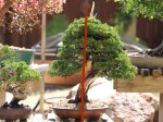
This is unbalanced, and stylistically, it's not appealing to me at all.
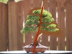
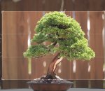
Here's another look, with the grid lines separating the tree out in equal thirds. It's pretty classical in design, lower third is all trunk, middle third contains most of the foliage, primary branches, and some views of the trunk, and the top third is apex. Not intentional, but by feel. Interesting how it just works out that way.
Last edited:
Brian Van Fleet
Pretty Fly for a Bonsai Guy
thomas22
Chumono
Nice photo at a distance of one of my favorite trees. Ready for some refinement wiring soon.
View attachment 181747
Really nice. I like that pot better that your last pot. I actually like this stage of your tree, and mine when they are in this stage. When the pads are a little fluffy and not so refined it looks a little more natural. Would you say you normally fine wire a tree like this every year, every two years, or every third year?
Brian Van Fleet
Pretty Fly for a Bonsai Guy
Thanks, wire is around 2 years on and one year off. I unwired it last spring and let it puff up. I’m hoping to prune and wire it this spring.Really nice. I like that pot better that your last pot. I actually like this stage of your tree, and mine when they are in this stage. When the pads are a little fluffy and not so refined it looks a little more natural. Would you say you normally fine wire a tree like this every year, every two years, or every third year?
fourteener
Omono
Balance, to me, is simply achieved when the pot serves as a stable, secure anchor point, with the trunk centered, or nearly so, and the apex peaks directly, or nearly directly over the base of the trunk.
Miyagi: "Better learn balance. Balance is key. Balance good, karate good, everything good. Balance bad, better pack up go home. Understand?"
Miyagi knows everything!!


