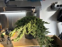
From the last two pictures it's hard to see what the trunk is doing after the lowest branches.
I understand it's a 2D photo so looks can be deceiving, but one helpful design consideration that's helped me in the past is to consider the negative space between your branches when you're looking at the tree from your chosen front. Think about the negative space as a deliberate choice and part of your composition. Think about how the negative space(s) on the left side relate to those on the right. Try and avoid clumps of overlapping branches and then having a big gap above them. Even if the branches are not clumped together from the same side of the trunk, one branch can create this effect with a back branch from a given angle. You need to avoid that from your chosen front.
Another good question is, 'how do my own eyes travel over the composition'. With this tree, my eyes start at the base and then travel straight up and then over to the left as it follows the wired down top branch and then back down to the clump of branches on either side.
What are your future plans for the tree / design? You may already planning an apex or more branches, so my comments may be premature, but you didn't mention. The top just doesn't sit right for me. Maybe if more of the trunk line was exposed, but I still think it needs a little bit extra on the top and maybe something slightly out to the right to balance it out.
I think it's great you are sharing your work and designs. I am a person that likes to dive in and learn by doing and learn by my mistakes. I've seen some harsh feedback, but I think if you can take the constructive feedback and work that into existing and future designs then you will only benefit and you will develop. There are plenty of people on here who can give you some really good insights.