Analyzing PBE 2024 Judging Data

Nao - thanks for the statistical analysis. Jonas has been doing a little on the side also. He tested narrowing the judging field to just the 7 professionals that had entries. With that significant change in judges the top-tier results ended up being nearly identical to the overall results. I believe the 1st and 2nd place swapped in one category, but no other significant divergence.

This whole thread would have been more interesting to me 10+ years ago. I find myself focused on the baseline and giant elements that impact the show overall, perhaps the perspective of a now 2X show organizer.
When Jonas and I look at venues we have to boil it down to some really simple questions:
1. How many people can comfortably fit into this room and look at bonsai displays.?
2. Can people get here, be happy about the effort to do so, and leave with a good impression?
3. Does the room / venue have a positive, neutral, or negative effect on a bonsai display?
4. What modifications are needed to mitigate any negatives of the venue and how much will that affect the cost to attendees? (e.g. lighting, security etc.)

As to the questions about tree design and flow - these are all good things to think about. But I'm struck by seeing some modern Japanese show books where displays have the same problems. It's not that they have and adhere to a universal set of principles. The most recent Sakafu-Ten album I saw had about 5 mind-blowing trees in it and the rest were a mix of good, muddled and downright wacky attempts.

We are going to be circulating some surveys for attendees, exhibitors and vendors to solicit feedback about the show sometime soon. (I was editing one this morning.)

Cheers.
 

I wonder in situations such as that, how to hint at the significance/meaning when it isnt clear. Its also important as a viewer to view an accent always as a metaphor first, a poetic device to dwell on its meaning before considering its aesthetic.
Traditionally in some art galleries or shows, the artist makes a statement if they so choose. Something conceptual like that would be mentioned in such a setting. Maybe PBE can include statements in their book as an addition? It would certainly answer some questions. 😂
 
Traditionally in some art galleries or shows, the artist makes a statement if they so choose. Something conceptual like that would be mentioned in such a setting. Maybe PBE can include statements in their book as an addition? It would certainly answer some questions. 😂

The program books did have artist statements for each tree. They were fun to read while checking out each tree and display
 
Hey @NaoTK im curious how the judges scored the two rock plantings. One was a shimpaku on an arched rock, probably a jan culek rock, and the other looked like an elm forest with a little azalea at the base.

Being the only real forest on rock style plantings and very “penjing” adjacent I’d want to know what the response from the judges were. I’m a sucker for these types of plantings also, so it’d be interesting to see how my tastes line up.
1731338707947.png
41/74
1731338880964.png

1731338937287.png
54/74
1731338954929.png

I felt the elm was let down by the pot. For such a unique composition to use a stock oval is a let down. Its not a bad pot in a vacuum but for this composition I would have picked a different color and maybe shallower+wider
 
View attachment 573949
41/74
View attachment 573951

View attachment 573952
54/74
View attachment 573953

I felt the elm was let down by the pot. For such a unique composition to use a stock oval is a let down. Its not a bad pot in a vacuum but for this composition I would have picked a different color and maybe shallower+wider
Funny you say. I hadn’t even considered the pot actually. For me it was the viewing angle. It felt like the composition had its back turned to us.
 
Liked the shimpaku on the arched rock, scale and proportions were good.

The elm/azalea didn't work for me, it was dramatic, maybe a perspective thing? felt like I was a giant among the landscape
I def liked both of them, but I love those types of plantings generally. For the purposes of a bonsai show, the shimpaku was so much better represented. Clear front, clean comp in a great pot. But if I could, I would almost rather have the elm planting on my benches. Maybe not the best tree or presentation for a bonsai show, but I just loved the look of it as an imaginative piece.
 
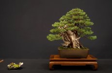
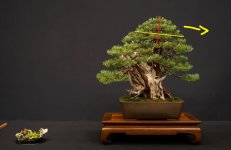
Yes this Sierra is moving to the right and the accent could go on the right. But the owner thought the pointing aspect was more important.
View attachment 573538
Just my feeling, but I think that the tree would be better (more dynamic) with a 5° inclination to the left. This way the accent would be fine on the left side, imo ->
__________DSCN026virt.jpg

Original tree ->
__________DSCN026.jpg
 
It still points right (to my eye,) with the direction of the apex.
I guess you could put the accent on the left or on the right.
But for me, if i have to choose, i'd say that the tree goes frankly to the left : the apex doesn't give any direction (vertical symmetry) but the main branch (bottom left) and especially the trunk go to the left ->
__________DSCN026virt2.jpg

Ryan made a video on Mirai Live a few years ago : the 3 elements to consider are the apex + the main branch + the trunk
 
A couple things I’d argue @clem .

Does the lowest branch on a tree automatically mean it’s the main branch? I think in this case it does, but I’ve seen many examples of the lowest branch clearly in opposition to the trees overall movement.

The trunk may start by moving left, but after your arrow stops, moves back right towards the apex.

And if it done right, most apex, usually, are as you represented. Rounded top with no clear lean or direction. I think when the apex delineates direction it’s more in response to where the trunk Carrie’s the apex.

The tilt you created with the tree certainly helps the directionality, but in my eyes also, it def moves left.
Not always, it is what Ryan Neil explained.

Sometimes the apex is inclined and thus gives a direction (cf the original tree) ->
__________DSCN026virt0.jpg

sometimes the apex is asymmetric like on this tree ->
_________DSCN03virt.jpg

Anyway, i think you can put the accent on the left or the right.
I would put it on the left, without hesitation, because this way, the focal point (the dead wood + live veins) is roughly in the middle of the composition and thus well highlighted ->
__________DSCN026virt3.jpg

If the accent is on the right side, the deadwood is offset to the left therefore less visible ->

__________DSCN026virt4.jpg


Everyone has their own vision ^^
 
Back
Top Bottom