Analyzing PBE 2024 Judging Data

Yes this Sierra is moving to the right and the accent could go on the right. But the owner thought the pointing aspect was more important.

The thing with that Sierra is that the left “pointing” branch is on the same horizontal level as the right pointing branch. It’s too flat, and doesnt seem like either branch is doing much in the way of directionality to me. I derive all the direction from the apex. I think the tree could be improved by removing that left branch and accentuating the rightward direction.
 
Definitely agree that the bottom branches on both sides are too flat, and the second-lowest branches on each side too. Is that visible live vein supporting anything besides the lowest left branch?

I wonder if removing the right lowest branch and then restyling the trunk, apex, and stop hiding the deadwood would be a good idea. It'd be a relatively big restyling and would change the direction to move left, but would accentuate the massive jins and get rid of the long visible bare branch.

1731001879278.png
 
The Bad

Interestingly, there was a notable gap between these 5 worst displays and the rest of the pack.

This was the lowest scored display, receiving 18 1's. Interesting that 5 people considered it a good display.
The trees are individually good, but its a conceptual mess. You got a painting, rock, 2 trees that look similar, and pointing everywhere. If the hornbeam in the middle was removed and the rock brought forward it would improve drastically.

View attachment 573452


This is a super fun thread, thanks for starting it Nao!

I really like the individual aspects of this display, but there are too many elements here. It's a bit overwhelming for me. All the trees, stone and painting could make up multiple displays. I think this demonstrates why negative space is actually so necessary and beautiful. Personally, I feel the strongest display here would be to remove everything except the Bujin and hornbeam on rock. I think it's a unique and beautiful Bunjin and hornbeam on rock. I like the suiseki, but could be redundant having two stones in the composition. I'd like to only see the Bunjin, small hornbeam and add a small proportional companion planting. I'm not sure about what the appropriate stand heights should be here. Overall, some really cool trees here that I really appreciate! Of course take my critique with a grain of salt as I'm not a pro-just a hobbyist and I put a star wars figurine in my accent because the Ewoks live in the redwood forest... haha
 
Jonas actually came to Portland to give a presentation on tree design and display in September.

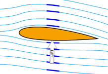
A traditional canopy with directionality should be like an airfoil or breaking wave with the blunt edge pointing in the direction of motion.

1731001178107.png

1731001335759.png

Both of these trees have the canopy shaped correctly in harmony with the tree's direction, but then a pointing branch and accent opposite the tree's direction. It's not clear to me if this opposite pointing is 'breaking the rules' or ideal.
We need an adult @Eric Schrader

1731001627927.png
1731001805227.png
 
Love seeing the data and love the discussion, thanks for putting this together @NaoTK. I am usually not a huge fan of the non-traditional accent pieces, but I like the clam rock and cup of olives in these displays, what do you all think?
They are both waaay too on the nose. Like the creator is standing next to me and nudging their elbow into me. eh? eh?
 
They are both waaay too on the nose. Like the creator is standing next to me and nudging their elbow into me. eh? eh?
Explain this Nao. Do you mean the accent are way too specific and literal? Or do you mean, they are so intertwined but you only know that if explained?
 
Jonas actually came to Portland to give a presentation on tree design and display in September.

A traditional canopy with directionality should be like an airfoil or breaking wave with the blunt edge pointing in the direction of motion.

View attachment 573565

View attachment 573566
I can’t help but feel that this description is trying too hard to describe something my eyes are not seeing.
 
Explain this Nao. Do you mean the accent are way too specific and literal? Or do you mean, they are so intertwined but you only know that if explained?
It's too literal, too thematic, too cute. Makes my eyes roll. Also someone does it at every show. A basket of apples...next to an apple tree! innovative

Think about the original intent of the accent plant in a tokonoma display...they should indicate the season, especially for an evergreen tree. So some fall-indicator plant that only flowers in fall or turns brown in fall.
For the olive example you could use a bronze tenpai with a farming theme to say it is fall time to pick olives
 
Last edited:
It's too literal, too thematic, too cute. Makes my eyes roll. Also someone does it at every show. A basket of apples...next to an apple tree! innovative
Haha. Yes totally fair critique and I get it. I think there is room for that type of thing with maybe a touch more subtlety involved. But I totally get it.
 
It's too literal, too thematic, too cute. Makes my eyes roll. Also someone does it at every show. A basket of apples...next to an apple tree! innovative

Think about the original intent of the accent plant in a tokonoma display...they should indicate the season, especially for an evergreen tree. So some fall-indicator plant that only flowers in fall or turns brown in fall.
For the olive example you could use a bronze tenpai with a farming theme to say it is fall time to pick olives
On the flip side of that, how many of the accent plants do you think are truly representative of the environment of the accompanying tree? Does something like that bother you at all. When I see hens and chicks or standard store bought sedum with wild yamadori, it tends to bother me.
 
Think about the original intent of the accent plant in a tokonoma display...they should indicate the season, especially for an evergreen tree. So some fall-indicator plant that only flowers in fall or turns brown in fall.
For the olive example you could use a bronze tenpai with a farming theme to say it is fall time to pick olives
This. I def think there is room for literal representation of there is a deeper thought put into the meaning beyond basic representation.
 
On the flip side of that, how many of the accent plants do you think are truly representative of the environment of the accompanying tree? Does something like that bother you at all. When I see hens and chicks or standard store bought sedum with wild yamadori, it tends to bother me.

Sedums do grow with most rocky yamadori so that's probably the angle.

When Dennis Vojtilla was preparing a tree for the 2021 Nationals we had a planning meeting on the accent plant. At that time I thought the accent HAD to have some contribution. But Dennis' philosophy is its more conservative and "safer" for the accent to just be a plant. So that's what he used. A clump. Nobody can say anything about a plant, so it is safer. So that is one approach. If you try too hard you can strike out.

The other thing that is lost in culture is all these "symbols" in Japan are obvious as hell. Everyone in Japan knows why a monkey is shown with a crab. do you?
I def do not.

I really appreciate the accompanying booklet to explain the displays thought to help make those connections. But I don’t think the idea always works with the visual.

From an artistic, purely visual perspective, there are a lot of things I think we constantly strike out on in regards to display. All symbolism aside. From wood types, to tones and colors presented. High gloss vs no gloss. Etc. I tend to lean more towards a harmonious/analogous/complimentary mentality vs one of contrast or opposites. There were too many times for me that the attempt to explain the decision making felt so forced. The visuals did not always line up with the idea IMO. The whole organic vs man made idea is so tired to me. Using the term organic was one our professors would jump all over us for using when presenting projects. It comes off as a cheap explanation for something that just needs more thought placed behind the display.
 
Sedums do grow with most rocky yamadori so that's probably the angle.
I think for me it’s more the ubiquity of many sedums I see presented that bothers me. With so many varieties of wildflowers, grasses, sedum, cacti etc, I would rather strike out in my attempt than mail it in to fit the mold.
 
I def do not.

I really appreciate the accompanying booklet to explain the displays thought to help make those connections. But I don’t think the idea always works with the visual.

From an artistic, purely visual perspective, there are a lot of things I think we constantly strike out on in regards to display. All symbolism aside. From wood types, to tones and colors presented. High gloss vs no gloss. Etc. I tend to lean more towards a harmonious/analogous/complimentary mentality vs one of contrast or opposites. There were too many times for me that the attempt to explain the decision making felt so forced. The visuals did not always line up with the idea IMO. The whole organic vs man made idea is so tired to me. Using the term organic was one our professors would jump all over us for using when presenting projects. It comes off as a cheap explanation for something that just needs more thought placed behind the display.
100% agree

And then we are limited by what we can get our hands on. I don't own a mahogany 21" x 6" tall stand with curvy details and skinny feet.

One thing Jonas encourages and we should really do is COLLABORATIVE display. Hey Ruddigger, can we use your awesome medium tree to go with this juniper and Danny your stand is perfect.
 
From a purely display perspective, the blue spruce right when you walk in on the left was one of my least favorite. Glossy stand, Matte finish pot, 4 different types of wood in different finishes, rectangles, undulating lines, accent plant, statue. Just too much across the board. But, then again, maybe I should just appreciate the effort.
 
Back
Top Bottom