Rocky Mt Juniper: First styling

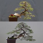
Here is an update on this tree. Slowly working in trying to develop and refine it. I took pictures today because I love when junipers get their grey-green winter foliage. Very hard to capture in the photos the depth on some of the back branches.


I have to still refine the end of this deadwood. It was roughed out last year but I still have to go in and do more work to it.

 
Looking great! Could you post a photo of the backside of the tree where you screwed in the piece of deadwood? I'd be interested to see how it has adapted to the rest of the tree. Thanks!
 
Looking great! Could you post a photo of the backside of the tree where you screwed in the piece of deadwood? I'd be interested to see how it has adapted to the rest of the tree. Thanks!

Yes sure Vin. It may not be until the weekend but I will. It is still a separate piece. I have not yet bothered filling the small gap between the deadwood and the tree and the small screw holes. If I were to ever show this tree, I most certainly will have to do so.
 
  • Like
Reactions: Vin
Mach, your work is amazing. It's very difficult for me to envision (no less actually pull it off) a styled tree like this. Thanks for posting.
 
Looking at the updated pic, I feel you've done such a good job with the material that your extra stick at the base is no longer needed.
Nice work, I hope to see an update of your other tall rmj sometime soon.
 
Nice tree. I just discovered this thread and read through from the beginning. Thank you for maintaining the progression :)

I have to say, I think the first styling is my favorite look. It's probably the overall silhouette of the foliage and the length/size of the branches compared to the trunk - it just feels balanced and composed and compact to me. To my very-non-expert eye the later silhouettes start to lose some of the feeling of proportion and negative space, and the trunk gets a little lost in the long branches and cloud of foliage.
image.jpeg image.jpeg
Putting them side by side helped me see and articulate what I was 'feeling' but I still can't completely pin it down. The loss of the negative space under the first left branch is the first thing that really jumps out at me. Don't get me wrong; I still think it's beautiful ;)

Thoughts?
 
I think I understand what he is saying and I tend to agree with him. In the original image the silhouette has lines that are more pleasing to me, not wrong, just different. The line of the trunk in the original image is more clearly defined and more pleasing to me. I think sometimes we here in America get lost in trying to produce these wonderful foliage pads just because they are more sexy than branches that look a bit more stressed out. I think with this tree there is more of an elegance to it's original sparseness.
 
Nice tree. I just discovered this thread and read through from the beginning. Thank you for maintaining the progression :)

I have to say, I think the first styling is my favorite look. It's probably the overall silhouette of the foliage and the length/size of the branches compared to the trunk - it just feels balanced and composed and compact to me. To my very-non-expert eye the later silhouettes start to lose some of the feeling of proportion and negative space, and the trunk gets a little lost in the long branches and cloud of foliage.
View attachment 88610 View attachment 88611
Putting them side by side helped me see and articulate what I was 'feeling' but I still can't completely pin it down. The loss of the negative space under the first left branch is the first thing that really jumps out at me. Don't get me wrong; I still think it's beautiful ;)

Thoughts?


Thanks Colin for your insights. Point taken and understood. I will disagree respectfully in that the image looks the best in the first styling. To me it is clear that it just that, a first draft. I think the design now is more compact and the negative spaces, while smaller, are very much present. I also think you need some areas where the trunk is partially obscured by foliage to create interest as opposed to exposing the entire length of it.

Regardless, I am glad you like at least one of the versions! :D

I think I understand what he is saying and I tend to agree with him. In the original image the silhouette has lines that are more pleasing to me, not wrong, just different. The line of the trunk in the original image is more clearly defined and more pleasing to me. I think sometimes we here in America get lost in trying to produce these wonderful foliage pads just because they are more sexy than branches that look a bit more stressed out. I think with this tree there is more of an elegance to it's original sparseness.


Vance we clearly see things different here. While you see the first image as more elegant, I see the last one as being so. In my view it has better balance and dynamics. Not sure that I have gotten "lost" in the pursuit of sexy foliage pads. I think it all boils down to intent. Some may prefer a more sparse image, some not. That is ok. I realize these things are based on personal taste.
 
Very nice work, as always. I really love all the trees that you post, and appreciate you taking the time to share as much as you do with us.

I was also going to add that it looks imbalanced to my eyes, but I can't place why exactly. I think for my taste there is just to much foliage for the trunk size that you have. I'm also not a huge fan of the deadwood that you added, although I would be interested in seeing this in person.

Really great work though, you have a fantastic eye for design, and have the technique to pull it off. If you're happy with it, that's all that counts!

Cheers!


Thanks Andrew. I agree. As I continue working with this tree it is very likely that the canopy gets edited and opened up. I do however like the added deadwood. I think anyone looking at it in person may agree with this choice? I still think it is needed but then again who knows in the future. It can be taken off easily if need be.

I'd like to brake the somewhat even silhouette on the right side and lighten it up a bit. We'll see!
 
Did a few quick virts of other possibilities. Of course we could think of a thousand. But keeping the current design, below are some editing exercises. I did not attempt to manipulate too much the existing foliage pads.


I like 1 the best - just a lighter or less congested appearance - consistent motion of the canopy back to the left. After the canopy has filled in, 3 might be better, but for now it is not, IMHO.

In 2, I feel that I want a more dynamic canopy going to the right, but I think it would be hard to do that for a while (branches need to extend more on the right and the apex would need to be pointed, or lean, to the right instead of as it is now, to the left). As posed, 2 is just a vertical tree being held in its midsection (like you/me holding up a bare rooted tree with one hand to photograph it with our cell phone camera) = borning. ;) 3 isn't that different to me.

Thanks for the fun, @MACH5; this is interesting stuff.
 
Did a few quick virts of other possibilities. Of course we could think of a thousand. But keeping the current design, below are some editing exercises. I did not attempt to manipulate too much the existing foliage pads.


My preference is #3
 
I like all the options highlighted above, but would want to move toward option 2. In my mind, less is more with the willowy, slightly feminine trunk you've got. Another option might be to keep both branches moving to the left but reduce the foliage on them slightly and put more curves in them which will effectively shorten them visually.
 
Thanks guys!

@Oso: Interesting insights and I agree. I like #1 the best. In does put into question whether the added deadwood is in fact needed as Andrew and wireme indicated. This tree may have in fact "outgrown" this feature.

@andrew: #3 is very similar to #1 except we are loosing that back branch at the bottom. I think I do like that branch. It really adds so much depth to the image albeit not so clearly apparent in the photo.

@DAVE: I hear you and a more simplistic design would work except I am leaning more towards a fuller tree but kept sparse enough to see through it. My worry about shortening the left branches is that I think it may tip the balance of the tree. I think as the design stands now it does need that left movement pull to keep it from "tipping over" to the right?


I will keep investigating design options as I work to refine this tree that will soon be with me for 20 years.
 
I like your style, but I think you can be more dramatic if you commit to the movement of the trunk and deadwood. I see no need to balance the foliage back over the base, in fact trying to balance it actually creates an imbalance for me.

I think your whole tree is here:
image.jpg
 
Back
Top Bottom