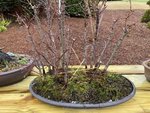
There's a lot of different forms of "forests". I like the vertical style of an old growth layout where the trunks are bare for a substantial length, while many people like what I call a clump where the trees are closer together at the base and all of the trunks bow outward. You need to choose one or the other. (There may be other layouts that can be called forests, so expect others to chime in) I like to be able to look up and see bare bottoms of branches and architecture. Some people prefer a low canopy with just the toes of the nebari visable. Most canopies eventually grow together into one canopy, with some individual canopies partly visible on the outskirts, while some others become one big helmet. My Maple forest is losing the individual canopies because I didn't start early enough to shape them that way. Alas.

This Tamarack forest has the same number of trees, 12, and has branching that lends itself to layers of branches and I have always maintained
the character of individual branching from day one. That kind of branch requires more space between the trees and forced me to space the trees further apart, which was good. It's too late to do that with the Maples. It also requires that the interior trees be taller than the trees in front so that a pyramid of ascending tops evolves. It looks more natural if you can place one or two slightly shorter trees in the interior, but then they need extra room. You do this with intent or it doesn't evolve right.

Layered branching requires wiring flat branches
before you attempt to merge them into a forest. It's a mechanical thing, -your hands will be hemmed-in by other branches and when they are pre-wired you are forced to position them
differently so the layers can be overlapping and still have space between them. So, a tree with normally good looking space between the layered branches will not have enough space between the branches to sit close enough to another tree to be in a forest. That means that most trees
must have too much space between layers if they were
not in the forest (read
that a couple times). Except, the branches on the outside left and outside right and straight out the the rear and straight out the front. Candidate trees that are one-sided have an obvious place, outboard. Trees with lousy branches but a good top are good interior occupants. The interior branches are going to do much more poorly than the outboard branches. That's life. But remember, you can't see the trees for the forest! As long as all the outboard branches are well spaced they will do well and the whole picture will be of as much foliage as is necessary to look like a forest. You want to observe some real important rules: There should be two groups, with a crooked or curving path between them. The groups should not be obviously separated, and only apparent when the viewer discovers the path, and even then it should look like a path through one forest, not two groups. The hardest thing to do is to arrange the trees so that no two trees are lined up one in front of another. This is more difficult than it sounds. There are two distinct looks, a distant forest with the biggest trees in back (Tamarack), or the close-up view with the biggest trees in front and smaller trees filling in space in the rear, or something in-between like these Maples. The viewer should have difficulty counting the trees. Even numbers are to be avoided because the brain more easily clumps things into pairs and it makes mental counting easier. Dissimilar spacing is useful in disguising numbers of individuals.
There is a tendency to pack the trees tighter in the beginning to please the eye,
in the beginning. Don't do that. They will grow and you are planning for what you want them to look like,
in the future.


