Talk to me about triangles.

JackHammer

Chumono
Messages
524
Reaction score
581
Location
North Eastern Ohio
USDA Zone
5b
I am thinking about design principals. Can someone please tell me any thoughts or best practices around the use of triangles?

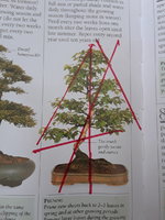
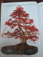
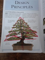
I drew a few triangles on some pictures.

Should the apex of the tree meet at the center of the pot? Good? Bad?
20230128_145751.jpg
Should the apex of the tree/triangle meet at the trunk line? Good?

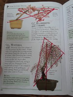
Should the trunk line discect the triangle? Good? Bad? (Like the wisteria image)
I like how on the flowering cherry the trunk line discets the triangle. Is that the apex? It is not the highest point on the tree. I don't understand this tree.
20230128_145545.jpg

20230128_145334.jpg

What relationship left or right to the center of the pot should the trunk have? In what ways does it impact the movement, or balance of the tree?
20230128_145042.jpg
I am also seeing a pattern of one large triangle, that is made up of smaller triangles. Sometimes there are 3, one left, right and top. Sometimes they seem to be upside down which I want to observe more.

Also, what about bonsai with cloud pads? Puffy triangles.... ?
 
The best practice is to use triangles is to make an abstract representation. Cones for three dimensional designs, because no tree is two dimensional.
But to use them in a final design is risky, none of the trees you show in those picture evoke an emotional response to me. They're perfect examples of well executed bonsai, and kind of boring. I'm not saying my trees are better, they're definitely worse in both execution and design. But also a bit more dramatic.
Personally, I like more dramatic designs and I can agree with moving away from the green helmets and green pyramids.
 
Definitely agree with @Wires_Guy_wires
I think it is likely the bonsai pictured were selected because they fitted the triangle theory rather than because they are great trees. Many great bonsai are only vaguely triangular or would need a great deal of imagination to fit into one. Can't see the point in limiting creativity with design rules like this.
 
You see a similar triangle concept taught in art theory in other media. The concept in bonsai is the same.
An isosceles triangle (however vague) is what's created when you combine a simplistic shape and asymmetry.

Why are these things important?
Too much complexity in the shape is both unnatural and bothersome to the eye. Your mind is not at rest while beholding the piece, they eyes bouncing from corner to nook to cranny incessantly. You eventually find yourself settling in space and not perceiving the thing a whole.
Asymmetry is the balancing factor. You don't want the eye to bounce all over, nor do you want it to stand still. The eye should casually meander across the entire scape. Why would the eye wander if it only needs half of the image to complete the picture in the mind?

Keep these reasons in mind when styling, and chances are you'll wind up with an isosceles triangle.
 
I wouldn't use that particular book as an example of good bonsai design. Many of the trees in it are moderately good examples, at best, and some are truly sticks in pots.

This thread made me look up some old threads we had started about the divine proportion and Fibonacci sequences as they apply to bonsai design. It touches on the pentagon and golden triangle.

Design: The Divine Proportion and natural sequences

Golden Mean Case Study #1

Golden Mean Case Study #2
This is really great feedback, thank you for sharing.

The goal isn't to boil down an art into cookie cutter shapes, the goal is to understand convention so that I can break it if and when it would be appropriate. I am thinking of this as maybe you would look at the rule of 3rds in photography. It is a convention and not every good photo follows it, but a lot do.

I also understand bonsai 101 isn't showing me the best examples. It is however showing what the world recognizes as bonsai, rather than a high art that this community would more readily ascribe to. I can understand the criticism though.
One of the reasons why I started the design threads on Divine Proportions was to get people to start to think about the application of design theory towards bonsai design. One of our old members, who went by the user name of "Sawgrass" had started a great design thread that got a lot of traction, but he ultimately asked to remove it from the site so that he could create his own design web site using the content. I don't think he ever got around to completing it, which is too bad because there were some great insights in the small quantity of content that he had started.

This is a great book, and one of the favorites in my bonsai library. It touches on many of the subjects you raise here.

Principles of Bonsai Design

PBDCoverfinalsmallcopy-min_large.jpg
 
TRIANGLES-

Somoko Kinyo Shu,
published in Japan in 1829, was the first illustrative instructional bonsai book which established Classical Bonsai Art.
This illustration was an “idealized” classic pine shape tree which explained that if these guidelines, ( followed by several pages depicting “taboo” branching) and forms are followed, a well balanced bonsai could be formed.

Today, most contemporary bonsai artists in Japan and around the world would not favor this design. But, remember, this is an instructive book published nearly 200 years ago. Please note that all the main branches are triangular, as are the foliage masses.

Today we realize that bonsai is a combination of art and horticulture and everything we do can be traced back to a principle. Horticuulturally, trees are shaped with a triangular silhouette because all branches will receive sun. Think of a hedge, sides taper to the top, or a Xmas tree.

Artistically, we shape bonsai in a basic triangular silhouette because of the three basic shapes (that’s all that exist) a triangle with a wide base will show stability more than other shapes. and settles the eyes. Even the base of the trunk is triangular.

OK, GO!
CLASSIC PINE.JPG
 
This is a good article I came across a few years ago. The author used to post on IBC forum and had some pretty cool elms.

Regarding the triangle stuff, I mainly just look at real trees for inspo and design ideas or bonsai that look like real trees.
 
There is an old thread on IBC - Internet Bonsai Club - titled "Show me your Brooms" which ended up being a pretty good discussion about broom style elms. It's at least 5 years old, maybe more,
yup, the author of the article I just posted, Andy rutledge has some trees on that thread. oldie but goodie.
 
Artistically, we shape bonsai in a basic triangular silhouette because of the three basic shapes (that’s all that exist) a triangle with a wide base will show stability more than other shapes. and settles the eyes. Even the base of the trunk is triangular.
I had started to write a long post about different triangles, but decided to delete it because it was more math and less art. A few things that are great about triangles: first as you move away from an equilateral triangle you generate energy and movement in your design. Second, you can over or under balance your triangles to generate asymmetry and create tension. Finally, the human mind tends to view the world in geometric shapes. If you suggest a triangle where one is not there... the human mind will fill in the blank. Some of the bonsai designs I find most interesting are the ones that use void space to "suggest" a triangle... when one does not exist.
 
One of the reasons why I started the design threads on Divine Proportions was to get people to start to think about the application of design theory towards bonsai design. One of our old members, who went by the user name of "Sawgrass" had started a great design thread that got a lot of traction, but he ultimately asked to remove it from the site so that he could create his own design web site using the content. I don't think he ever got around to completing it, which is too bad because there were some great insights in the small quantity of content that he had started.

This is a great book, and one of the favorites in my bonsai library. It touches on many of the subjects you raise here.

Principles of Bonsai Design

View attachment 470461
I already ordered it!
 
This is a good article I came across a few years ago. The author used to post on IBC forum and had some pretty cool elms.

Regarding the triangle stuff, I mainly just look at real trees for inspo and design ideas or bonsai that look like real trees.
Andy rutlage came up a lot when I was looking for design articles, I like his stuff. I look at trees when I walk my dogs but it is also helpful to recognize patterns when I see them.
 
One of the reasons why I started the design threads on Divine Proportions was to get people to start to think about the application of design theory towards bonsai design. One of our old members, who went by the user name of "Sawgrass" had started a great design thread that got a lot of traction, but he ultimately asked to remove it from the site so that he could create his own design web site using the content. I don't think he ever got around to completing it, which is too bad because there were some great insights in the small quantity of content that he had started.

This is a great book, and one of the favorites in my bonsai library. It touches on many of the subjects you raise here.

Principles of Bonsai Design

View attachment 470461
Thanks! I've been looking for a reasonable price on this. :) I was looking months ago and only found one for $200.
 
TRIANGLES-

Somoko Kinyo Shu,
published in Japan in 1829, was the first illustrative instructional bonsai book which established Classical Bonsai Art.
This illustration was an “idealized” classic pine shape tree which explained that if these guidelines, ( followed by several pages depicting “taboo” branching) and forms are followed, a well balanced bonsai could be formed.

Today, most contemporary bonsai artists in Japan and around the world would not favor this design. But, remember, this is an instructive book published nearly 200 years ago. Please note that all the main branches are triangular, as are the foliage masses.

Today we realize that bonsai is a combination of art and horticulture and everything we do can be traced back to a principle. Horticuulturally, trees are shaped with a triangular silhouette because all branches will receive sun. Think of a hedge, sides taper to the top, or a Xmas tree.

Artistically, we shape bonsai in a basic triangular silhouette because of the three basic shapes (that’s all that exist) a triangle with a wide base will show stability more than other shapes. and settles the eyes. Even the base of the trunk is triangular.

OK, GO!
Hello @William N. Valavanis, thank your for your input to this thread. Do you know if there are any translated versions of Somoko Kinyo Shu? I've only seen the original Japanese version.
 
Back
Top Bottom