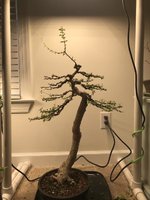
@JuniperSol - I'm surprised your Escambron is leafless. They are normally only leafless for a short period during the driest months in Puerto Rico. Did you defoliate before your styling? It makes sense to defoliate, makes wiring and pruning for structure and shape much easier. You should be leafed out by now. Do you have a photo with leaves?
The scientific name for Escambron is currently
Volkameria aculeata, a 2010 molecular analysis showed it did not belong in
Clerodendrum. The taxonomy people may end up moving it again, but currently it looks like the name
Volkameria aculeata will be good for a while. Most books probably still have it listed as
Clerodendrum aculeata.
They naturally have knobs and lumps where nodes exist. If you remove the knobs, to smooth out the trunk you will eliminate possibility of the trunk back budding at that location. Knobby & lumpy is normal for this species. In time the bark will develop vertical cracks and plates. The smooth bark is a temporary condition.
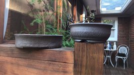
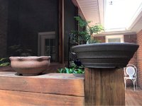
Over all, I like what you have done with this tree, very nice. As for choosing a pot, there are a few different options. You can choose a pot to highlight the light colored bark. Especially if you plan to defoliate before exhibiting. Here the unglazed chocolate brown, or a dark gray would be appropriate.
If you want to highlight the flowers, you can use a glazed blue or green color to offset the white flowers. Because the leaves are green and the flowers are white, I would probably go with a deep blue color. Or a blend of colors with blue being a dominant hue.
If you want to highlight the lush green of the foliage, you can go with a yellow or a blue. Generally you either want to match the color, with the pot being a darker or lighter color than the color of the green. Some trees have blue tints to their green, some have yellow tints to their green. Or you can compliment the color of the foliage (often easier than a match). Here a blue or a yellow will highlight the undertones of the green leaves.
So think about which feature you want to highlight, trunk, leaves or flowers, and then pick a pot to support that feature. I would go with a blue glaze of some sort, but I like blue. It is a "safe bet".
As to shape, I think round is a good choice. If you develop more dense, more massive foliage clouds, you might move to an oval.
Depth of pot. A shallow wide pot sets the stage as an open field viewed from a distance. A deep tall pot sets the stage as a vertical cliff. In between sizes can be interpreted as a tree close to you. The wider the pot is, the shallower the pot is, the more virtual distance you create between the viewer and the tree. The shape of the pot both grounds the image and separates it from the shelf or table, separates it into its own visual world.
Picking a pot is not easily described but intuitively when you see the right pot you will "know'' it is the right one.
I would go with a 10 to 12 inch diameter pot that is fairly shallow, dark blue, black and blue, maybe with metallic gold highlighted glaze. The deeper the pot the smaller the diameter. A 3 inch deep round, would only need to be maybe 9 inches diameter. A one inch deep round might need to be 12 or more inches diameter.
Literati style is named for the classical Chinese characters in the formal script. Chinese Zen missionaries brought reading and writing to the Japanese. Modern classical Japanese uses about 90% Chinese characters or symbols. Chinese and classical Japanese characters are not phonetic, they are symbolic, they are abstract line drawings representing ideas. No clue to pronunciation in the characters. For example man is essentially a stick figure of a man. A family home is an abstract stick figure of a pig with an abstract roof over it. In that families in Japan and China tended to live in compounds, with multiple small homes, and livestock all enclosed by a wall.
Literati bonsai was named for trees that were free form and abstract, like the characters of classical Japanese or Chinese writing. Literati tend to be tall trees, with small pots. Usually round pots. The curves, bends, zigs & zags should be free moving and in abstract ways remind one of calligraphy. Think free jazz, improvised shapes that are not literal "trees".


