Forrestford
Shohin
That bark looks amazing! Nice progression.
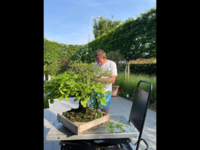
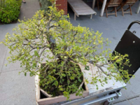
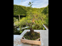
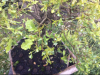
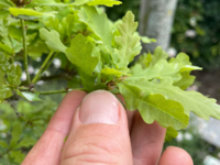
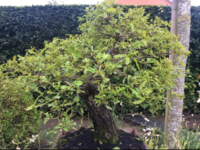
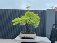
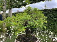
Of course...im one for using wild tree trees for inspo, but there are some characteristics i tend not to follow, like horizontal branches in the crown. or, having ascending branches, rising branches underneath horizontal branches, it spoils the theme. if your low and mids are rising, the apical branches just look better if they follow the theme.
i try not to have too many crossing primary branches also, especially in the main primarys that set the tone for the tree, its ok to have crossing bits in the finer twigging. i love a natural image as much as the next guy, but i think there should be harmony too. not too much confliction.
well in my original post id said there were 1 or 2 things id do that could make the tree better, i didnt need to zoom in.In the photos, this tree is excellent. Of course the photos are like viewing this tree from a distance. You have done excellent work. This is a fine tree. I love the bark. In the brief amount of time I looked at the photos I did not see the problems that @BobbyLane noted, but I did not magnify the photos on my laptop. He is correct in that "angle of insertion" of the branch into the trunk sets a "theme" for the tree, and should be followed through the tree. Lowest branches should be near horizontal, higher branches increasingly vertical as you go up in the tree. But I did not see any obvious violations of this guideline. Of course I'm not seeing the tree in person. The "angle of insertion" for a branch to the trunk is a key trait that goes a long way to making a tree look natural.
You've done a fine job developing this tree, it is very nice.
for example the two over lapping primary branches on the left could be tweaked.
