Design: Golden Mean Case Study #1

I find the first image most pleasing for two reasons. First, the smaller green mass, which is close to the trunk emphasizes the trunk, which is clearly the tree's best feature. Additionally, in the first image the positive space on the right of the trunk (foliage) is in balance with the negative space the trunk's left.

In two and three, the trunk is increasingly deemphasized and the balance taken farther askew.
 
There is no "right" or "wrong" answer.

Image #1 I created to fit the golden mean. If you buy into this design concept, tree #1 should feel the most "balanced" and "solid". As you move away from the golden mean, you are introducing a sense of imbalance / energy into the design.

Some may find image #1 "boring" because it is so balanced / static. They find image #2 interesting because there is an element of movement and energy.

Pretty universally people found image #3 TOO imbalanced. The eye was being thrown off to the right. The branch seemed too low.

Image #2 is Masahiko Kimura's original design.
 
There is no "right" or "wrong" answer.

Image #1 I created to fit the golden mean. If you buy into this design concept, tree #1 should feel the most "balanced" and "solid". As you move away from the golden mean, you are introducing a sense of imbalance / energy into the design.

It would be helpful if you told us more about the process...what did you measure and change to make image 1 conform more closely to the golden mean? Did you overlay a spiral onto some part of the canopy or determine ratios between certain parts of the canopy, etc? That seems to be a big sticking point, i.e. exactly what do you choose to use as your measuring points...because as I've said before, you can draw lots of lines depending on your point of view.
 
I was drawn to the second image when it was in a pot, but liked the first better in the second set of photos you provided. Interesting.
 
There is no "right" or "wrong" answer.

Image #1 I created to fit the golden mean. If you buy into this design concept, tree #1 should feel the most "balanced" and "solid". As you move away from the golden mean, you are introducing a sense of imbalance / energy into the design.

Some may find image #1 "boring" because it is so balanced / static. They find image #2 interesting because there is an element of movement and energy.

Pretty universally people found image #3 TOO imbalanced. The eye was being thrown off to the right. The branch seemed too low.

Image #2 is Masahiko Kimura's original design.

Very interesting experiment. I would have guessed whichever to be within the ratio to be the most attractive. Explains the "too perfect" reaction. Also shows that while being perfect is not the most attractive, tipping the scale the other way and going to far from the ratio is deemed unattractive by most.

Also demonstrates what has already been said. Many renown artists of all forms use the golden mean. I'm very doubtful Kimura intentionally applied any mathematical techniques to this tree. Using his experience and skill he created something aesthetically beautiful and interesting while maintaining structural proportions with the material he had. The result, a tree which comes very close to the ratio, unintentionally so, while retaining it's beauty and natural feel.
goes to show just how engrained it truly is into the human mind and our perception of beauty.

Lets see some more . . .
 
Last edited:
It would be helpful if you told us more about the process...what did you measure and change to make image 1 conform more closely to the golden mean?

I think the whole spiral thing has people confused. The golden ratio or golden mean is simply when you divide a line so that the ratio of the longer segment to the total is the same as the shorter segment to the longer segment. It is an irrational number that is infinite and non-repeating, similar to pi. But rather than get into a confusing discussion about math, think about it as dividing anything into two pieces of approx 62% length and 38% length. If you want to continue the sequence, you would go to the longer piece and divide it again, by 62% and 38%, and so on.

But I don't want to confuse the discussion by talking about infinite series - like branches moving up a trunk, development of ramification, etc. I tried to create the most simple example I could - that of an informal upright bonsai with a descending branch. The descending branch is the focus of the design, and the height of the bonsai foliage is the total design height. Therefore, according to the Golden Mean, the design will be "in balance" if the descending branch descends to 38% of the height to the total tree.
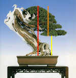
1_1b.jpg

In this case the ratio of orange line to red line is exactly equal to ratio of yellow line to orange line.

It is a design guideline to help you decide "how far should I let that branch descend?" And people are absolutely correct - some people will be able to eyeball it or just "feel" it. They might start with design 3 and say "way too long" and go to design 1 and say "too boring" and go to design 2 and say "just right".

Again this is an "exploration" of this design principle. It is not to say it is an absolute law to be followed.

It is really hard to create these examples, because as people have pointed out, if you DID decide to go with design 1, you probably would do something different with the foliage while maintaining the same general ratios and outline.

By the way - to point out other aspects of this design. Notice how the apex is exactly centered over the nebari, and the line of the deadwood trunk is exactly parallel to the outline of the foliage.
 
Last edited:
OK, now we have something concrete to work from! Thanks for clarifying.

If I put a ruler up against my computer screen, I calculate the ratio for the actual Kimura tree (soil surface to lowest part of canopy / soil surface to top of canopy) to be about .319, which is very close to the 1/3 that people often use (and I suspect that the 1/3 ratio is actually a simplification of the .38 golden ratio, as it's the closest easy fraction you can use. 1/4 = .25 and 1/2 = .5, so 1/3 is closest to .38)

If I compare to your modified tree #1, I get .404 which is very close to the .38 value. But the original Kimura tree looks better to me. I wonder if that's partly due to the fact that many design their bonsai using the 1/3 approximation, so I'm "used" to seeing that.

I'm going to have to do some additional measurements on this tree when I have time. One thing that becomes apparent as the canopy is extended down/out to the right is a disturbing (to me) symmetry between the angle of the trunk and the angle of the canopy. When the canopy is shorter (version 1) that similarity is minimized.
 
Personally, after looking at the three choices and reading the first page of this thread I still prefer the third image. To me it seems more balanced as the trunk with all the jin and shari overpower the image in #2 and moreso in #1 IMO.

ed
 
If I compare to your modified tree #1, I get .404 which is very close to the .38 value.

LOL, you didn't need to do all that work, you could have just asked me. It's exactly .382. I made a custom 100 cm ruler, and added a bar that was exactly 38.2 cm long. Then I saved it as a custom layer that I can stretch or shrink, so no matter what I align it against, I will always have a marker that is 38.2% of the total. I'll be using the same ruler on all these examples.

1_11.jpg
 
Last edited:
LOL, you didn't need to do all that work, you could have just asked me. It's exactly .382. I made a custom 100 cm ruler, and added a bar that was exactly 38.2 cm long. Then I saved it as a custom layer that I can stretch or shrink, so no matter what I align it against, I will always have a marker that is 38.2% of the total. I'll be using the same ruler on all these examples.

OK, now I am sure you're nuts!
 
There is no "right" or "wrong" answer.

As you move away from the golden mean, you are introducing a sense of imbalance / energy into the design.

Could we explain this part of the quote. Is this not a definition of dynamism?
 
dy·na·mism/ˈdīnəˌmizəm/
noun
the quality of being characterized by vigorous activity and progress.
the theory that phenomena of matter or mind are due to the action of forces rather than to motion or matter.
 
dy·na·mism/ˈdīnəˌmizəm/
noun
the quality of being characterized by vigorous activity and progress.
the theory that phenomena of matter or mind are due to the action of forces rather than to motion or matter.

There are many definitions of the word with regards to its context. Look it up with regards to art.
 
Here is one;

Dynamism is a process or mechanism responsible for the development or motion of a system. Continuous change,activity,or progress
 
I don't think imbalance and dynamic go together. Just an opinion, but I think balance is important to all art, including bonsai.
 
Imbalance equals tension, tension equals movement. Movement equals excitement.
 
I don't think imbalance and dynamic go together. Just an opinion, but I think balance is important to all art, including bonsai.

Define balance as it equates to bonsai?
 
Balance, as I understand it, is that:
1. The tree does not appear as though it is going to fall over. It has the appearance of a strong base which will hold it firmly to the ground.

2. If you were to divide an image of a tree into 4 quadrants, each would be balanced by the quadrant next to or adjacent from it. For example, the tree in this thread, image one, has balance. The foliage is counter balanced by the negative space adjacent to it.

This is not to say that symmetry is necessary for me in art, but that I prefer an image with balance.
 
Back
Top Bottom