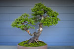
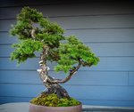
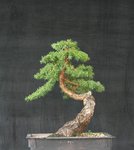
These pictures.....
Correction....
This process doesn't really do this tree justice.
We shouldn't do this without the next deeper understanding of why we are making these decisions.
This easily fixable eye grabbing ugliness will have most people not like this front, even if it is the better front.
That orange is ugly, unnatural, and anyone that has seen cedar apple rust will certainly feel this. The large white Shari on the right frames this entire eye grabbing grossness. The eye naturally moves to the leftmore bit of Jin, which points directly at the siding seam, which points directly at that unnatural angle at the top of that cut.

You will get good opinions, but for the wrong reasons.
I'd like to fix the orange and show a view of this which is more appropriate, so people can actually feel this, but my editor isn't good.
Just removing what makes that angle unnatural can change feelings.

Fix that orange, get a better pic, and Let's see what changes!
I would like to see the small trunk to the back. It will help it look smaller. The large one seems to have a nice forward lean then too.
Sorce


