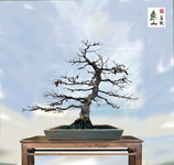
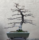
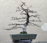
Thanks J, it's gaining more character each season... I'd purchased 3 seedling from a vendor at the first MABA show in Des Moines* and I also recall that for the first time in the US there was a Chinese Vendor with various accouterments including gorgeous daiza along with pottery. Whoa, I purchased a mame stand that I've not yet used as I have only a few started about 4 yrs ago as they require such attention during the season that It has always scared me to think something might be dry....and here in the valley of CA...dang that's a for sure thing. Harry Tomlinson was the Master in Residence for the show.
*I was one of the workshop leaders along with George Randall, rip (phono shot in '13 a few years prior to his passing) he's been gone a long time. He was one of the early Michigan bonsai enthusiasts who had a degree in Geology aka: Earth Sciences. During WWII he was a navigator on B52's over Germany. Great guy, learned a lot from George and bought a few of his collected yamadori from N. Michigan....Which I later sold prior to my move here as too much to move so I only hope some of them are still going....
I do have to say that the next year Four Seasons Bonsai Club of Michigan sponsored the MABA 2000** event and the Consul General was very involved in getting Masahiko Kimura (first time in the USA) to attend as top Master. The show held in Detroit brought folks from Europe, Japan, and So Africa to name just a few.....

As long as I'm reminiscing here's a nice piece that the Consul General Japan Midwest/Michigan/Detroit region did with regards to events. The Consulate was a very busy place in those days entertaining celebrity folks from industry and educational institutions, Naoto Amaki was quite the guy as Consul General, he asked if he could take a few beginner lessons in bonsai and oh my we had fun! Nate was working on a small juniper and of course his wife was seated near and under tones in Japanese were spoken to him as she was 'semi directing' the lesson and after several hours, finally a bust of high speed Japanese was blurted out and she became very quite.....he looked at me with a sheepish 'grin' and we both silently smiled. Mr.s Amaki-San did not speak a word the balance of the lesson...
** pin for the event which I designed and had made for the club and MABA


